Picking typefaces
Annotations
Transcript
00:00
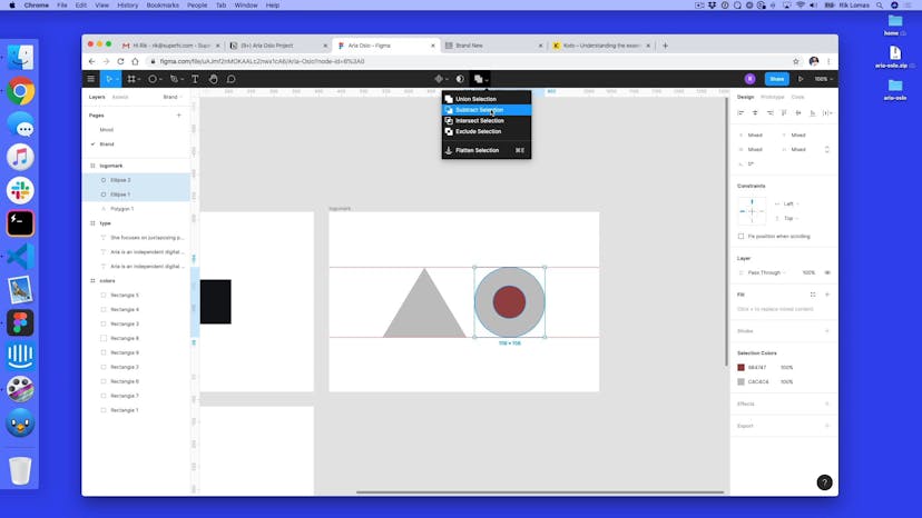
- [Rik] So, at the moment, all the type is in Roboto. Just the kind of default in Figma. So, if I click on all of them, they're all exactly Roboto Regular. But we might not want to use this. Looks pretty good as it is, but maybe you wanna kind of go and do a different typeface. Maybe she doesn't even like this typeface as well, so how do we go about this? So, because this is a web project, we actually need to use something that is allowed to be used on the Web.
00:24
So, some typefaces are not allowed to be used on the Web. So, we have to kind of limit ourselves to free fonts, for instance, or ones that have licenses to use for the Web. So, the one thing that we're gonna be using is actually Google Fonts. So, this is fonts.google.com. And in here we have nearly 1000 typefaces that we can use. Now, how do we actually go about picking which ones we want to use? Now, Roboto is the one that we actually have at the moment.
00:47
And this is sorted by trending. So, we could actually looking through all of these and say, "Maybe I wanna use Montserrat, or Roboto Condensed," which is actually a thinner version. How do we go about picking these typefaces? Well, firstly, there's categories. So, maybe I wanna use ones which are serif fonts. The kind of, like, ones with the little things on the ends of all the letters. Or, maybe I just wanna stick with sans serif for now, and just go with ones that I kind of like the look of.
01:14
And I can just go through these, and kind of match them. So, if I just keep scrolling down, I can kind of go, like, "Maybe there's something that I actually like in here." Now, what we can do is type something in here. So, I can actually use some of this. Copy, so I'm gonna take this, and type it in here. And this is gonna be something like a Sentence or Paragraph. I can actually pick if I don't have any text. So, I can kind of look through this and kind of pick and choose what I like.
01:40
Now, if I just quickly pick one of these, so, let's see, Nunito Sans. So, here we can actually see what it looks like at different sizes. I've got things like 16, which is this small. So, maybe I can go, "Oh, maybe this one looks pretty good as some text." Does it work well at bigger sizes? Maybe 40's one that we picked. It's okay, it's not great. Maybe I wanna just stick with Nunito Sans for the kind of default one.
02:05
So, for the smaller one, I'm just gonna say this one is gonna be Nunito Sans. And I can actually pick this from this dropdown. If I can scroll through, I can quickly find, or not too quickly, but Nunito Sans is in here, and actually change this as well. But default, the regular one works for me. But this at the moment feels like it clashes. It's too close to each other. So, maybe I wanna move away from Roboto. Now, luckily, as part of this, if we scroll down to the bottom, there are things like this up here now, Pairings.
02:35
We can actually see what it works with. So, there's a few things we can actually pick this to go with. So, maybe Roboto with a Black weight. No, that's kind of maybe the other way around as well. Maybe that kind of works. That could work for us. Maybe Black goes to Bold, if a little bit too thick. That could work for us as well. So, what I can do is actually use some of these tools on top of this.
02:57
There are other things that we could use as part of the Internet, which is things like Type Party, which is a free, open-sourced type on the web, created by Milan, who used to work at SuperHi. We can see here, lots of different typefaces that we can use. There's also newsletters at freshfonts.io. We can go to the newsletter and sign up, and that should get lots of things. There's us, actually, hello! And also there's places like Typewolf, as well.
03:21
Now, the one that we're actually gonna use in the end, is one called Josefin Sans. So, I'm just gonna quickly find this one, Josefin Sans. That one, and Josefin Sans on that as well. And again, I can play around with some of the weighting on this. So, maybe I wanna make this a little bit more thicker. Maybe some, like, Semibold works for here, and Regular works for that. Again, this is kind of playing around with some of these types on Google Fonts and seeing what works together.
03:47
So, use some of the kind of resources that we've used. This is the one that we're actually gonna use as the final one. But what we can do is play around with this. And again, so much of the color, this takes time. Like, don't expect it to be perfect on the first go. This one took a long time for us to work on, and actually get it right. So, don't feel too frustrated. Keep going, keep trying out different things. Even kind of copy this Artboard, and paste it next to each other, and see which one you like best.
04:12
Maybe give Aria an option of two, or three, and see which works best for you.
SuperHi FM
Want some ambient music in the background? Play our radio station!

