Don’t worry, we are here to help you with:
Remember, there’s no such thing as a silly question, so don’t hesitate to reach out, we love hearing from you!
Diving deeper into learning about HTML and CSS, we build a single-column website and make its layout responsive by adding media queries. We also learn about more HTML elements and the CSS box model.
There's two methodologies in web design about which way to design – the first is mobile-first where you design and code for mobiles then use responsive design to add layout.
The second is desktop-first where you design and code for desktops and use responsive design to remove layout.
There's no one right way of course, it's up to your own preference.
Think about what most of your users are using the site for. For instance, a lot of restaurant websites look amazing on desktop screens but most of the use-cases for it are looking up the address and the menu on the go – is it worth designing mobile-first for this case? Probably yes. Most of the users will never see the full desktop experience and will probably never care. All they want to do is get to the restaurant and eat.
I'm currently playing an iPhone game called Mini Metro. It's a strategy game where you have to move shapes around a map based on subway lines you make.
On Mini Metro, you start with a few stations and eventually it gets to hundreds as shown in the picture. The main problem is when you start going from simple to complex, all the subway lines start to become a mess and you have to start again from scratch.
Same problem is with complex websites. It's hard to start with a mobile-first design because the more features you add later on, the more complex and tricky it gets to put them in. The more knock-on effects you'll encounter.
For most websites, I like to start with desktop-first designs. It lets me see the overall picture and I can plan to make it simpler using responsive design rather than adding complexities.
Again this is my personal preference. Every designer and coder is different. Every project is different.
An easy way to think about this is that padding
is for adding space inside an element and margin
for adding space outside! Using margins also allows us to centre the content on the page in this project, something you can ’t do with padding.
For example, if you have a div
with text inside it, and you want spacing between the text and the div
’s borders, then you ’d use padding. If you want spacing between the div
’s borders and completely separate element that ’s outside of the div
, that you ’d use margins.
So for the body
element specifically we could’ve used either margin
or padding
for the top spacing — which you choose in this case is mainly down to personal preference — but only margin
for the left and right spacing.
One thing to watch out for in CSS is margin collapsing: in elements that are vertically stacked — and not float
ed — only the largest margin will count to the vertical space between the elements.
Sometimes the situation could be a bit more tricky, and the case for using margins vs. padding could be more ambiguous. And sometimes, your website will still work perfectly well, regardless of which one you choose! But it ’s important to understand the distinction, even when the line between the two gets blurry sometimes.
One tip I have for learning further is this: when you’re coding HTML and CSS, play around with very obvious background colors or border colors (such as red), so that you can easily see the impact of margins vs padding. Then when you’re done styling/developing your website, you can change the background color back to what it ’s supposed to be.
If you’re not using borders, it can be harder to tell the difference (and visually, the impact will often be the same!)
There’s two methods that CSS uses to determine whether or not it applys a rule, the first is whether the second rule is written below the first — this is where the "C" in CSS comes in, it stands for "cascading"! — and the second is by specificity. So if you write section.section_one
in your first selector and only section
in the second then even though the second selector comes after the first any overlapping properties will default to the first, this is because the first selector is more specific than the second. You can read more about specificity here.
max-width
will make the element never be larger than the maximum size — but still let it be smaller if need be! — whereas width
will force it to always be that size.
In the case of our images, max-width: 100%;
means that the image won ’t be any larger than the image's "container" (the element wrapping it). By default, images are displayed at their natural size, so if we have an image that ’s 4000 pixels wide it ’ll also take up 4000px
on the page and break the layout, so we want to scale it down.
We could use width: 100%;
here but the reason for using max-width
is that if we had an image that ’s naturally smaller — maybe it's only 100 pixels wide — then we don ’t want to force it to stretch out to that width, as that ’ll make the image look pixelated.
You can also use them together! If you use width: 100%
and max-width: 1200px
then that'll make the image take up the full container until it hits 1200px
at which point it'll stop growing.
Make sure you check your line-height
! Line height is one of those special rules that can accept a variety of values so while we want line-height: 1.5
— so the line height is 1.5x the text height — it's very easy to instead write line-height: 1.5px
and end up with a line height that's only 1.5px
tall!
For SEO purposes you want to make sure that you always have an <h1>
tag on your website. In this case we don't have any text that would serve for this but using a logo instead is perfectly acceptable. For best practices make sure you also add alt
text to your logo, describing either what it is or what it says.
If you're using the v2 Editor then you can type in font-family: and click the little button that comes up. From there you can select the Google font you wish to use and the Editor will add the extra stylesheets in for you.
If you're using the standard Editor you can add an @import
statement to the top of your CSS. For example, if you want to add Space Mono you put https://fonts.googleapis.com/css?family=Space+Mono:regular&display=swap
up top to import it and then font-family: "Space Mono";
in your body tag to use it.
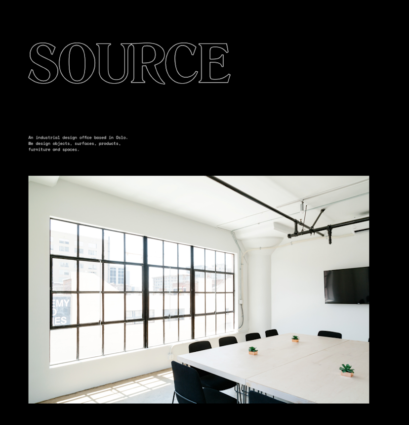
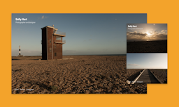
Minimal, dark and monospace is the order of the day for this week’s project, which has been designed by Sydney based graphic and digital designer Matt Vernon. Matt was a student on our very first SuperHi course! The main things to think about with this design is using max-widths to constrain each of the image sections with their quotes. There’s also a bit of helper code in the copy.txt to get you up and running with the custom font used in the project.
A place for you to post notes about anything on this page. Only you can view your notes.